;stroke-width:0px;}%3c/style%3e%3clinearGradient%20id='Degradado_sin_nombre_3'%20x1='993.28627'%20y1='-179.86134'%20x2='-9.62936'%20y2='400.65514'%20gradientUnits='userSpaceOnUse'%3e%3cstop%20offset='0'%20stop-color='%23011781'/%3e%3cstop%20offset='.59897'%20stop-color='%23002fdd'/%3e%3cstop%20offset='1'%20stop-color='%230082e6'/%3e%3c/linearGradient%3e%3c/defs%3e%3cg%3e%3cpath%20class='cls-1'%20d='M896.07535,270.53973l-.00006.00004c-35.81778,20.67941-81.61781,8.40733-102.29721-27.41046L659.20706,10.04547l.00007-.00004c35.81778-20.67941,81.61781-8.40733,102.29721,27.41046l134.57102,233.08384ZM826.65058,130.29272l69.4248-120.24725v-.00006c-35.81787-20.67938-81.61792-8.40729-102.29736,27.41046l-10.36328,17.94995,43.23584,74.8869ZM728.63178,150.29248l-69.42456,120.24725v.00006c35.81763,20.67938,81.61768,8.40729,102.29712-27.41046l10.36353-17.94995-43.23608-74.8869ZM298.61936,10.56566l-37.5874,88.46433c-2.03,5.31507-3.73742,11.14089-5.12598,17.46447-1.39412,6.33007-2.59914,12.2801-3.60765,17.84544h-4.55498c-1.26991-5.56535-2.46937-11.44956-3.60765-17.65542-1.13828-6.19937-2.84756-11.95937-5.12598-17.27537L201.04228,10.56566h-73.65647l88.4634,181.48457h67.96321L372.27583,10.56566h-73.65647ZM214.33089,150.66516v121.87587h71.37991v-121.87587h-71.37991ZM559.45273,10.56566l.38005,125.67261c0,7.59349.25027,15.18698.76009,22.78047.50426,7.59349,1.13828,15.31675,1.89837,23.15958h-3.4167c-3.03851-8.09774-6.20679-15.81544-9.49186-23.15958-3.29249-7.33858-6.71104-14.0487-10.25195-20.12293l-61.508-107.44805c-4.05073-6.83433-7.84747-12.0187-11.39023-15.56702-3.54647-3.54091-9.11182-5.31507-16.7053-5.31507h-31.51224c-16.7053,0-25.05888,8.35265-25.05888,25.05888v236.91648h66.44303v-130.22852c0-7.08275-.32072-14.48714-.94919-22.2104-.63403-7.71863-1.459-15.2463-2.46751-22.59137h3.4167c2.02258,7.34507,4.55683,14.68272,7.59349,22.0213,3.03665,7.34414,6.07516,14.17847,9.11182,20.50298l64.16461,111.62392c3.79674,6.83433,7.5286,12.02519,11.20114,15.56702,3.66697,3.5474,9.30277,5.31507,16.89625,5.31507h31.89228c16.44947,0,24.67884-8.35265,24.67884-25.05888V10.56566h-65.68479ZM119.91841,279.6364c-25.47719-10.88605-45.03144-34.07385-45.03144-74.8869V75.8357C74.88698,34.47681,41.35897.9488.00007.9488h-.00007v203.8007c0,41.35889,33.52801,74.8869,74.8869,74.8869h45.03151ZM182.27302,276.53045v.00007h0s-23.85712,0-23.85712,0c-37.80944,0-69.81178-28.87333-72.61406-66.57879-.05642-.75919-.10384-1.52513-.14206-2.29786h27.73668c38.03948,0,68.87656,30.83709,68.87656,68.87656Z'/%3e%3c/g%3e%3c/svg%3e)
Line
Continuous evolution with a time tooltip. The default for series.
Every new question ends up with the same person, the same spreadsheet and the same lost morning.
Analytics, included in the Lynx core, turns asset telemetry into useful information. Two ways to work: permanent dashboards with automatic refresh and quick charts for one-off analysis.
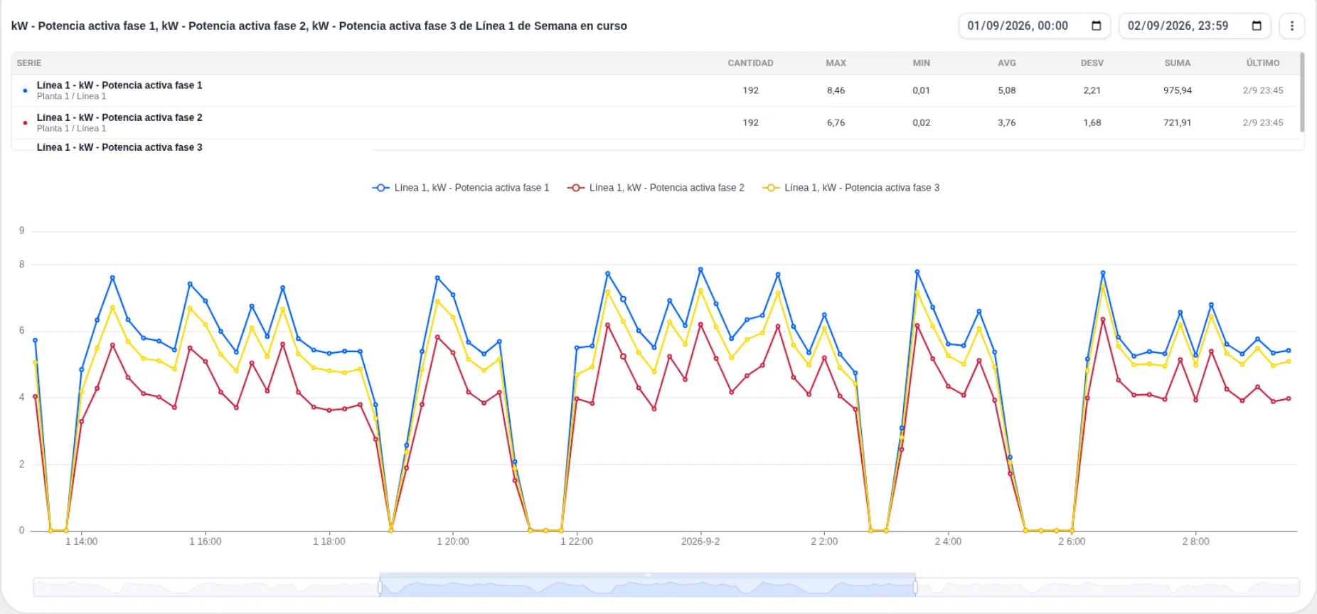
Two spaces. Dashboard, for day-to-day operations. Charts, for the one-off question that should not clutter the permanent panels.
Focused on daily operations. Compose the panel with the required charts, set the display period for the measurements and Lynx keeps the view up to date with no intervention.
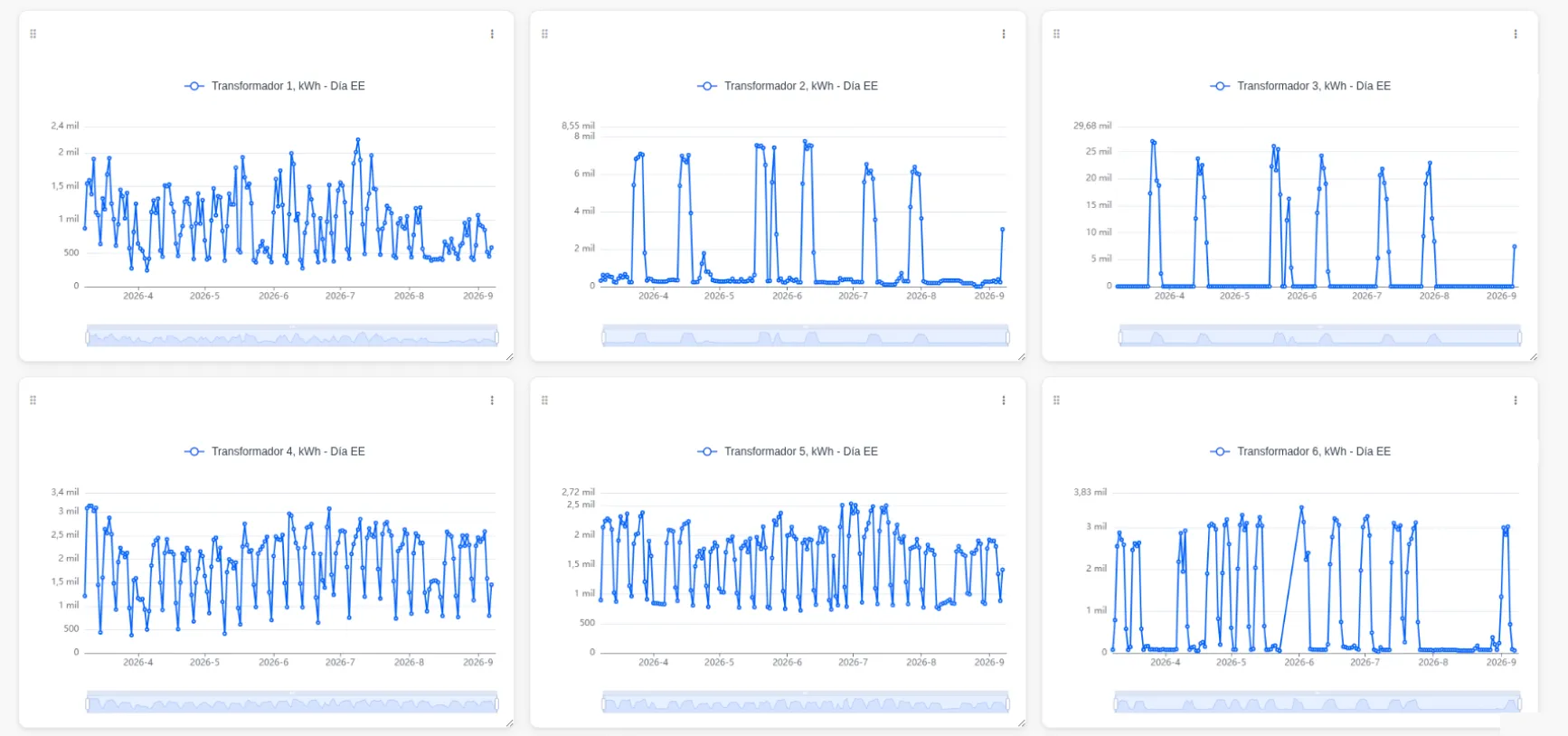
Somebody asks what happened on Tuesday at three. You build the chart, look at that moment and move on: it stays in the browser cache and does not clutter the permanent panels.
Charts in Dashboard and Charts share the same set of actions, with several types available and the flexibility to add new ones.
Continuous evolution with a time tooltip. The default for series.
Fill under the curve to highlight trend and volume.
Ideal for discrete data or sharp changes between states.
These are the three main types — with the flexibility to add new ones when needed.
The «New chart» wizard guides from type and period to assets and signals, so any user can configure it with no learning curve.

The one that costs half a morning, a spreadsheet and the same person every time. We build it in the demo with data from one of your lines, and that is where your first dashboard comes from.
Or write to us directly at support.dt@dominion-global.com
One moment before you carry on
We would like to measure which pages are read and where the site is abandoned, using Google Analytics. It is aggregate information, it carries no advertising and it goes no further. Until you decide, nothing is loaded.
What exactly is measured